Lisp has a long and rich history and so does the development of Graphical User Interfaces in Lisp. In fact, the first GUI builder was written in Lisp (and sold to Apple. It is now Interface Builder).
Lisp is also famous and unrivalled for its interactive development capabilities, a feature even more worth having to develop GUI applications. Can you imagine compiling one function and seeing your GUI update instantly? We can do this with many GUI frameworks today, even though the details differ from one to another.
Finally, a key part in building software is how to build it and ship it to users. Here also, we can build self-contained binaries, for the three main operating systems, that users can run with a double click.
We aim here to give you the relevant information to help you choose the right GUI framework and to put you on tracks. Don’t hesitate to contribute, to send more examples and to furnish the upstream documentations.
Introduction
In this recipe, we’ll present the following GUI toolkits:
- Tk with Ltk and nodgui
- Qt4 with Qtools
- IUP with lispnik/iup
- Gtk3 with cl-cffi-gtk
- if you want Gtk4 bindings, see cl-gtk4. They are new bindings, released in September, 2022.
- Nuklear with Bodge-Nuklear
In addition, you might want to have a look to:
- the CAPI toolkit (Common Application Programming Interface), which is proprietary and made by LispWorks. It is a complete and cross-platform toolkit (Windows, Gtk+, Cocoa), very praised by its users. LispWorks also has iOS and Android runtimes. Example software built with CAPI include ScoreCloud. It is possible to try it with the LispWorks free demo.
- Allegro CL’s IDE and Common Graphics windowing system (proprietary): Allegro’s IDE is a general environment for developing applications. It works in concert with a windowing system called Common Graphics. The IDE is available for Allegro CL’s Microsoft Windows, on Linux platforms, Free BSD and on the Mac.
- NEW! 🎉 since Allegro CL 10.1 (released in March of 2022), the IDE, and the Common Graphics GUI toolkit, runs in the browser. It is called CG/JS.
- CCL’s built-in Cocoa interface, used to build applications such as Opusmodus.
- Clozure CL’s built-in Objective-C bridge and CocoaInterface, a Cocoa interface for CCL. Build Cocoa user interface windows dynamically using Lisp code and bypass the typical Xcode processes.
- the bridge is good at catching ObjC errors and turning them into Lisp errors, so one can have an iterative REPL-based development cycle for a macOS GUI application.
- McCLIM and Garnet are toolkit in 100% Common Lisp. McClim even has a prototype running in the browser with the Broadway protocol and Garnet has an ongoing interface to Gtk.
- Alloy, another very new toolkit in 100% Common Lisp, used for example in the Kandria game.
- eql, eql5, eql5-android, embedded Qt4 and Qt5 Lisp, embedded in ECL, embeddable in Qt. Port of EQL5 to the Android platform.
- this demo using Java Swing from ABCL
- examples of using Gtk without C files with SBCL, as well as GTK-server.
- Ceramic, to ship a cross-platform web app with Electron.
- read more: Electron and web views (webview, webui, CLOG Frame) on Web Apps in Lisp.
- the Barium toolkit
- an example application: ChessLab (2025)
as well as the other ones listed on awesome-cl#gui and Cliki.
Tk (Ltk and nodgui)
Tk (or Tcl/Tk, where Tcl is the programming language) has the infamous reputation of having an outdated look. This is not (so) true anymore since its version 8 of 1997 (!). It is probably better than you think.
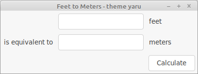
This is a simple GUI with nodgui’s built-in theme (more on that below):
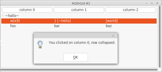
This is a treeview, with the same theme:
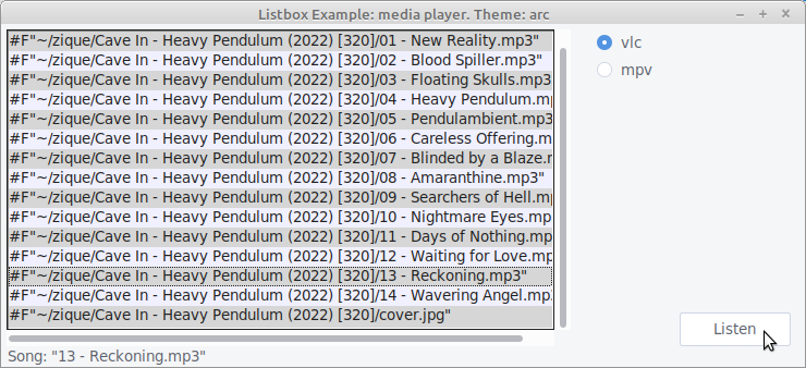
A toy mediaplayer, showing a tree list, checkboxes, buttons and labels, with the Arc theme:
This is a demo with a Macos theme:
In addition to those, we can use many of the ttkthemes, the Forest theme, and more. See this tcl/tk list.
But what is Tk good for? Tk doesn’t have a great choice of widgets, but it has a useful canvas, and it has a couple of unique features: we can develop a graphical interface fully interactively and we can run the GUI remotely from the core app. It is also cross-platform.
So, Tk isn’t native and doesn’t have the most advanced features, but it is a used and proven GUI toolkit (and programming language) still used in the industry. It can be a great choice to quickly create simple GUIs, to leverage its ease of deployment, or when stability is required.
There are two Lisp bindings: Ltk and nodgui. Nodgui (“No Drama GUI”) is a fork of Ltk, with added widgets (such as an auto-completion list widget), an asynchronous event loop and, what we really enjoy, the surprisingly nice-looking “Yaru” theme that comes with the library. It is also very easy to install and use any other theme of our choice, see below.
- Tk is Written in: Tcl
-
Portability: cross-platform (Windows, macOS, Linux).
-
Widgets: this is not the fort of Tk. It has a small set of default widgets, and misses important ones, for example a date picker. We can find some in extensions (such as in Nodgui), but they don’t feel native, at all. The calendar is brought by a Tk extension and looks better.
-
Interactive development: very much.
-
Graphical builder: no
- Other features:
- remote execution: the connection between Lisp and Tcl/Tk is done via a stream. It is thus possible to run the Lisp program on one computer, and to display the GUI on another one. The only thing required on the client computer is tcl/tk installed and the remote.tcl script. See Ltk-remote.
- Bindings documentation: short but complete. Nodgui too.
- Bindings stability: very stable
- Bindings activity: low for Ltk (mostly maintenance), active for nodgui (new features).
- Licence: Tcl/Tk is BSD-style, Ltk is LGPL.
- Example applications:
- Fulci - a program to organise your movie collections.
- Ltk small games - snake and tic-tac-toe.
- cl-pkr - a cross-platform color picker.
- cl-torrents - searching torrents on popular trackers. CLI, readline and a simple Tk GUI.
- More examples:
- https://peterlane.netlify.app/ltk-examples/: LTk examples for the tkdocs tutorial.
- LTk Plotchart - A wrapper around the tklib/plotchart library to work with LTk. This includes over 20 different chart types (xy-plots, gantt charts, 3d-bar charts etc…).
List of widgets
(please don’t suppose the list is exhaustive)
Button Canvas Check-button Entry Frame Label Labelframe Listbox
Menu Menubutton Message
Paned-window
Radio-button Scale
Scrollbar Spinbox Text
Toplevel Widget Canvas

Ltk-megawidgets:
    progress
    history-entry
    menu-entry
nodgui adds:
treelist tooltip searchable-listbox date-picker calendar autocomplete-listbox
password-entry progress-bar-star notify-window
dot-plot bar-chart equalizer-bar
swap-list
Qt4 (Qtools)
Do we need to present Qt and Qt4? Qt is huge and contains everything and the kitchen sink. Qt not only provides UI widgets, but numerous other layers (networking, D-BUS…).
Qt is free for open-source software, however you’ll want to check the conditions to ship proprietary ones.
The Qtools bindings target Qt4. The Qt5 Lisp bindings are https://github.com/commonqt/commonqt5/ and not ready for prime time..
A companion library for Qtools, that you’ll want to check out once you made your first Qtool application, is Qtools-ui, a collection of useful widgets and pre-made components. It comes with short demonstrations videos.
- Framework written in: C++
- Framework Portability: multi-platform, Android, embedded systems, WASM.
-
Bindings Portability: Qtools runs on x86 desktop platforms on Windows, macOS and GNU/Linux.
-
Widgets choice: large.
-
Graphical builder: yes.
-
Other features: Web browser, a lot more.
- Bindings documentation: lengthy explanations, a few examples. Prior Qt knowledge is required.
- Bindings stability: stable
- Bindings activity: active
- Qt Licence: both commercial and open source licences.
- Example applications:
- https://github.com/Shinmera/qtools/tree/master/examples
- https://github.com/Shirakumo/lionchat
- https://github.com/shinmera/halftone - a simple image viewer
Gtk+3 (cl-cffi-gtk)
Gtk+3 is the primary library used to build GNOME applications. Its (currently most advanced) lisp bindings is cl-cffi-gtk. While primarily created for GNU/Linux, Gtk works fine under macOS and can now also be used on Windows.
- Framework written in: C
-
Portability: GNU/Linux and macOS, also Windows.
-
Widgets choice: large.
- Graphical builder: yes: Glade.
-
Other features: web browser (WebKitGTK)
- Bindings documentation: very good: http://www.crategus.com/books/cl-gtk/gtk-tutorial.html
- Bindings stability: stable
- Bindings activity: low activity, active development.
- Licence: LGPL
- Example applications:
- an Atmosphere Calculator, built with Glade.
- more documentation and examples:
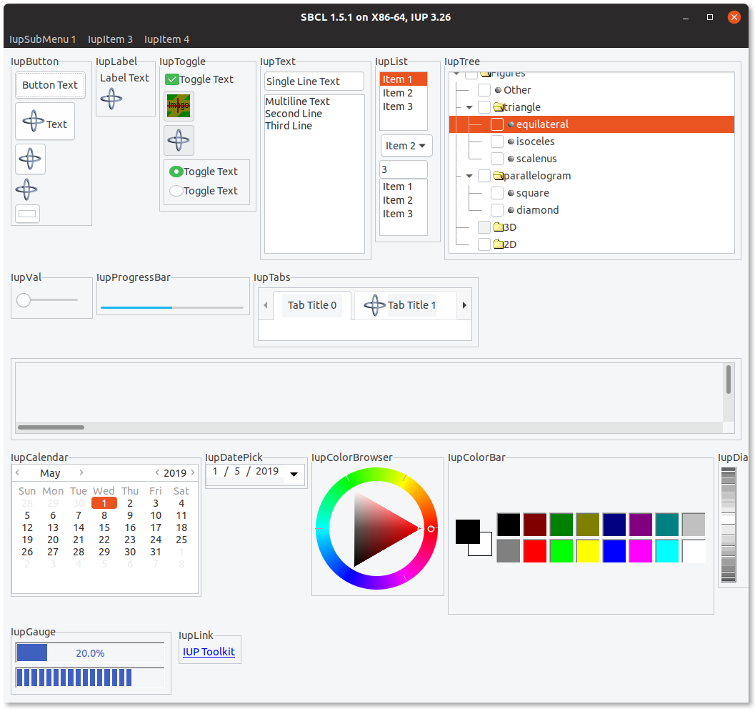
IUP (lispnik/IUP)
IUP is a cross-platform GUI toolkit actively developed at the PUC university of Rio de Janeiro, Brazil. It uses native controls: the Windows API for Windows, Gtk3 for GNU/Linux. At the time of writing, it has a Cocoa port in the works (as well as iOS, Android and WASM ones). A particularity of IUP is its small API.
The Lisp bindings are lispnik/iup. They are nicely done in that they are automatically generated from the C sources. They can follow new IUP versions with a minimal work and the required steps are documented. All this gives us good guarantee over the bus factor.
IUP stands as a great solution in between Tk and Gtk or Qt.
- Framework written in: C (official API also in Lua and LED)
-
Portability: Windows and Linux, work started for Cocoa, iOS, Android, WASM.
-
Widgets choice: medium. Includes a web browser window (WebkitGTK on Linux, IE’s WebBrowser on Windows).
-
Graphical builder: yes: IupVisualLED
-
Other features: OpenGL, Web browser (WebKitGTK on GNU/Linux), plotting, Scintilla text editor
- Bindings documentation: good examples and good readme, otherwise low.
- Bindings stability: alpha (but fully generated and working nicely).
- Bindings activity: low but steady, and reactive to new IUP versions.
- Licence: IUP and the bindings are MIT licenced.
List of widgets
Radio, Tabs, FlatTabs, ScrollBox, DetachBox,
Button, FlatButton, DropButton, Calendar, Canvas, Colorbar, ColorBrowser, DatePick, Dial, Gauge, Label, FlatLabel,
FlatSeparator, Link, List, FlatList, ProgressBar, Spin, Text, Toggle, Tree, Val,
listDialog, Alarm, Color, Message, Font, Scintilla, file-dialog…
Cells, Matrix, MatrixEx, MatrixList,
GLCanvas, Plot, MglPlot, OleControl, WebBrowser (WebKit/Gtk+)…
drag-and-drop
WebBrowser
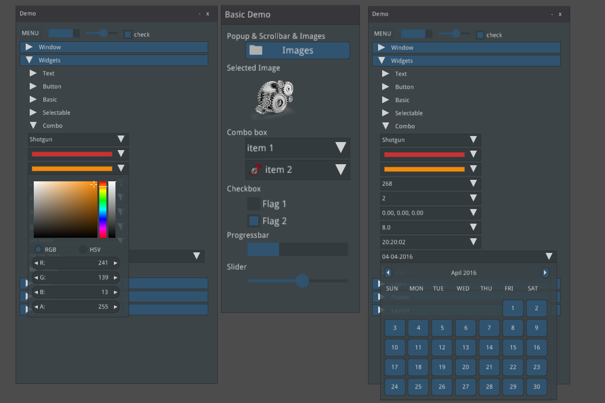
Nuklear (Bodge-Nuklear)
Nuklear is a small immediate-mode GUI toolkit:
Nuklear is a minimal-state, immediate-mode graphical user interface toolkit written in ANSI C and licensed under public domain. It was designed as a simple embeddable user interface for application and does not have any dependencies, a default render backend or OS window/input handling but instead provides a highly modular, library-based approach, with simple input state for input and draw commands describing primitive shapes as output. So instead of providing a layered library that tries to abstract over a number of platform and render backends, it focuses only on the actual UI.
its Lisp binding is Bodge-Nuklear, and its higher level companions bodge-ui and bodge-ui-window.
Unlike traditional UI frameworks, Nuklear allows the developer to take over the rendering loop or the input management. This might require more setup, but it makes Nuklear particularly well suited for games, or for applications where you want to create new controls.
- Framework written in: ANSI C, single-header library.
-
Portability: where C runs. Nuklear doesn’t contain platform-specific code. No direct OS or window handling is done in Nuklear. Instead all input state has to be provided by platform specific code.
-
Widgets choice: small.
-
Graphical builder: no.
-
Other features: fully skinnable and customisable.
- Bindings stability: stable
- Bindings activity: active
- Licence: MIT or Public Domain (unlicence).
- Example applications:
- Trivial-gamekit
- Obvius - a resurrected image processing library.
- Notalone - an autumn 2017 Lisp Game Jam entry.
List of widgets
Non-exhaustive list:
buttons, progressbar, image selector, (collapsable) tree, list, grid, range, slider, color picker,
date-picker
Getting started
Tk
Ltk is quick and easy to grasp.
(ql:quickload "ltk")
(in-package :ltk-user)
How to create widgets
All widgets are created with a regular make-instance and the widget name:
(make-instance 'button)
(make-instance 'treeview)
This makes Ltk explorable with the default symbol completion.
How to start the main loop
As with most bindings, the GUI-related code must be started inside a macro that
handles the main loop, here with-ltk:
(with-ltk ()
  (let ((frame (make-instance 'frame)))
    …))
How to display widgets
After we created some widgets, we must place them on the layout. There
are a few Tk systems for that, but the most recent one and the one we
should start with is the grid. grid is a function that takes as
arguments the widget, its column, its row, and a few optional
parameters.
As with any Lisp code in a regular environment, the functions’ signatures are indicated by the editor. It makes Ltk explorable.
Here’s how to display a button:
(with-ltk ()
  (let ((button (make-instance 'button :text "hello")))
    (grid button 0 0)))
That’s all there is to it.
Reacting to events
Many widgets have a :command argument that accept a lambda which is
executed when the widget’s event is started. In the case of a button,
that will be on a click:
(make-instance 'button
  :text "Hello"
  :command (lambda ()
             (format t "clicked")))
Interactive development
When we start the Tk process in the background with (start-wish), we
can create widgets and place them on the grid interactively.
See the documentation.
Once we’re done, we can (exit-wish).
Nodgui
To try the Nodgui demo, do:
(ql:quickload "nodgui")
(nodgui.demo:demo)
but hey, to load the demo with the better looking theme, do:
(nodgui.demo:demo :theme "yaru")
or
(setf nodgui:*default-theme* "yaru")
(nodgui.demo:demo)
Nodgui UI themes
To use the “yaru” theme that comes with nodgui, we can simply do:
(with-nodgui ()
  (use-theme "yaru")
  …)
or
(with-nodgui (:theme "yaru")
  …)
or
(setf nodgui:*default-theme* "yaru")
(with-nodgui ()
  …)
It is also possible to install and load another tcl theme. For example, clone the Forest ttk theme or the ttkthemes. Your project directory would look like this:
yourgui.asd
yourgui.lisp
ttkthemes/
Inside ttkthemes/, you will find themes under the png/ directory (the other ones are currently not supported):
/ttkthemes/ttkthemes/png/arc/arc.tcl
You need to load the .tcl file with nodgui, and tell it to use this theme:
(with-nodgui ()
   (eval-tcl-file "/ttkthemes/ttkthemes/png/arc/arc.tcl")
   (use-theme "arc")
   … code here …)
and that’s it. Your application now uses a new and decently looking GUI theme.
Qt4
(ql:quickload '(:qtools :qtcore :qtgui))
(defpackage #:qtools-test
  (:use #:cl+qt)
  (:export #:main))
(in-package :qtools-test)
(in-readtable :qtools)
We create our main widget that will contain the rest:
(define-widget main-window (QWidget)
  ())
We create an input field and a button inside this main widget:
(define-subwidget (main-window name) (q+:make-qlineedit main-window)
  (setf (q+:placeholder-text name) "Your name please."))
(define-subwidget (main-window go-button) (q+:make-qpushbutton "Go!" main-window))
We stack them horizontally:
(define-subwidget (main-window layout) (q+:make-qhboxlayout main-window)
  (q+:add-widget layout name)
  (q+:add-widget layout go-button))
and we show them:
(with-main-window
  (window 'main-window))
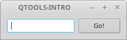
That’s cool, but we don’t react to the click event yet.
Reacting to events
Reacting to events in Qt happens through signals and slots. Slots are functions that receive or “connect to” signals, and signals are event carriers.
Widgets already send their own signals: for example, a button sends a “pressed” event. So, most of the time, we only need to connect to them.
However, had we extra needs, we can create our own set of signals.
Built-in events
We want to connect our go-button to the pressed and
return-pressed events and display a message box.
- we need to do this inside a
define-slotfunction, - where we establish the connection to those events,
- and where we create the message box. We grab the text of the
nameinput field with(q+:text name).
(define-slot (main-window go-button) ()
  (declare (connected go-button (pressed)))
  (declare (connected name (return-pressed)))
  (q+:qmessagebox-information main-window
                              "Greetings"  ;; title
                              (format NIL "Good day to you, ~a!" (q+:text name))))
And voilà. Run it with
(with-main-window (window 'main-window))
Custom events
We’ll implement the same functionality as above, but for demonstration
purposes we’ll create our own signal named name-set to get emitted when
the button is clicked.
We start by defining the signal, which happens inside the
main-window, and which is of type string:
(define-signal (main-window name-set) (string))
We create a first slot to make our button react to the pressed
and return-pressed events. But instead of creating the message box
here, as above, we send the name-set signal, with the value of our
input field..
(define-slot (main-window go-button) ()
  (declare (connected go-button (pressed)))
  (declare (connected name (return-pressed)))
  (signal! main-window (name-set string) (q+:text name)))
So far, nobody reacts to name-set. We create a second slot that
connects to it, and displays our message. Here again, we precise the
parameter type.
(define-slot (main-window name-set) ((new-name string))
  (declare (connected main-window (name-set string)))
  (q+:qmessagebox-information main-window "Greetings"
        (format NIL "Good day to you, ~a!" new-name)))
and run it:
(with-main-window (window 'main-window))
Building and deployment
It is possible to build a binary and bundle it together with all the necessary shared libraries.
Please read https://github.com/Shinmera/qtools#deployment.
You might also like this Travis CI script to build a self-contained binary for the three OSes.
Gtk3
The documentation is exceptionally good, including for beginners.
The library to quickload is cl-cffi-gtk. It is made of numerous
ones, that we have to :use for our package.
(ql:quickload "cl-cffi-gtk")

(defpackage :gtk-tutorial
  (:use :gtk :gdk :gdk-pixbuf :gobject
   :glib :gio :pango :cairo :common-lisp))

(in-package :gtk-tutorial)
How to run the main loop
As with the other libraries, everything happens inside the main loop
wrapper, here with-main-loop.
How to create a window
(make-instance 'gtk-window :type :toplevel :title "hello" ...).
How to create a widget
All widgets have a corresponding class. We can create them with
make-instance 'widget-class, but we preferably use the constructors.
The constructors end with (or contain) “new”:
(gtk-label-new)
(gtk-button-new-with-label "Label")
How to create a layout
(let ((box (make-instance 'gtk-box :orientation :horizontal
                                   :spacing 6))) ...)
then pack a widget onto the box:
(gtk-box-pack-start box mybutton-1)
and add the box to the window:
(gtk-container-add window box)
and display them all:
(gtk-widget-show-all window)
Reacting to events
Use g-signal-connect + the concerned widget + the event name (as a
string) + a lambda, that takes the widget as argument:
(g-signal-connect window "destroy"
  (lambda (widget)
    (declare (ignore widget))
    (leave-gtk-main)))
Or again:
(g-signal-connect button "clicked"
  (lambda (widget)
    (declare (ignore widget))
    (format t "Button was pressed.~%")))
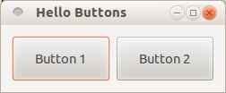
Full example
(defun hello-world ()
  ;; in the docs, this is example-upgraded-hello-world-2.
  (within-main-loop
    (let ((window (make-instance 'gtk-window
                                 :type :toplevel
                                 :title "Hello Buttons"
                                 :default-width 250
                                 :default-height 75
                                 :border-width 12))
          (box (make-instance 'gtk-box
                              :orientation :horizontal
                              :spacing 6)))
      (g-signal-connect window "destroy"
                        (lambda (widget)
                          (declare (ignore widget))
                          (leave-gtk-main)))
      (let ((button (gtk-button-new-with-label "Button 1")))
        (g-signal-connect button "clicked"
                          (lambda (widget)
                            (declare (ignore widget))
                            (format t "Button 1 was pressed.~%")))
        (gtk-box-pack-start box button))
      (let ((button (gtk-button-new-with-label "Button 2")))
        (g-signal-connect button "clicked"
                        (lambda (widget)
                          (declare (ignore widget))
                          (format t "Button 2 was pressed.~%")))
        (gtk-box-pack-start box button))
      (gtk-container-add window box)
      (gtk-widget-show-all window))))
IUP
Please check the installation instructions upstream. You may need one system dependency on GNU/Linux, and to modify an environment variable on Windows.
Finally, do:
(ql:quickload "iup")
We are not going to :use IUP (it is a bad practice generally after all).
(defpackage :test-iup
  (:use :cl))
(in-package :test-iup)
The following snippet creates a dialog frame to display a text label.
(defun hello ()
  (iup:with-iup ()
    (let* ((label (iup:label
                     :title
                     (format nil "Hello, World!~%IUP ~A~%~A ~A"
                       (iup:version)
                       (lisp-implementation-type)
                       (lisp-implementation-version))))
           (dialog (iup:dialog label :title "Hello, World!")))
      (iup:show dialog)
      (iup:main-loop))))
(hello)
Important note for SBCL: we currently must trap division-by-zero errors (see advancement on this issue). So, run snippets like so:
(defun run-gui-function ()
  #-sbcl (gui-function)
  #+sbcl
  (sb-int:with-float-traps-masked
      (:divide-by-zero :invalid)
    (gui-function)))
How to run the main loop
As with all the bindings seen so far, widgets are shown inside a
with-iup macro, and with a call to iup:main-loop.
How to create widgets
The constructor function is the name of the widget: iup:label,
iup:dialog.
How to display a widget
Be sure to “show” it: (iup:show dialog).
You can group widgets on frames, and stack them vertically or
horizontally (with vbox or hbox, see the example below).
To allow a widget to be expanded on window resize, use :expand
:yes (or :horizontal and :vertical).
Use also the :alignement properties.
How to get and set a widget’s attributes
Use (iup:attribute widget attribute) to get the attribute’s value,
and use setf on it to set it.
Reacting to events
Most widgets take an :action parameter that takes a lambda function
with one parameter (the handle).
(iup:button :title "Test &1"
:expand
:yes
:tip "Callback inline at control creation"
:action (lambda (handle)
(iup:message "title" "button1's action callback")
iup:+default+))
Below we create a label and put a button below it. We display a message dialog when we click on the button.
(defun click-button ()
  (iup:with-iup ()
    (let* ((label (iup:label :title
                      (format nil "Hello, World!~%IUP ~A~%~A ~A"
                          (iup:version)
                          (lisp-implementation-type)
                          (lisp-implementation-version))))
           (button (iup:button :title "Click me"
                               :expand :yes
                               :tip "yes, click me"
                               :action
                               (lambda (handle)
                                 (declare (ignorable handle))
                                 (iup:message "title"
                                              "button clicked")
                                 iup:+default+)))
           (vbox
            (iup:vbox (list label button)
                      :gap "10"
                      :margin "10x10"
                      :alignment :acenter))
           (dialog (iup:dialog vbox :title "Hello, World!")))
      (iup:show dialog)
      (iup:main-loop))))

#+sbcl
(sb-int:with-float-traps-masked
      (:divide-by-zero :invalid)
    (click-button))
Here’s a similar example to make a counter of clicks. We use a label and its title to hold the count. The title is an integer.
(defun counter ()
  (iup:with-iup ()
    (let* ((counter (iup:label :title 0))
           (label (iup:label :title
                     (format nil "The button was clicked ~a time(s)."
                             (iup:attribute counter :title))))
           (button (iup:button :title "Click me"
                               :expand :yes
                               :tip "yes, click me"
                               :action (lambda (handle)
                                         (declare (ignorable handle))
                                         (setf (iup:attribute counter :title)
                                               (1+ (iup:attribute counter :title 'number)))
                                         (setf (iup:attribute label :title)
                                               (format nil "The button was clicked ~a times."
                                                       (iup:attribute counter :title)))
                                         iup:+default+)))
           (vbox
            (iup:vbox (list label button)
                      :gap "10"
                      :margin "10x10"
                      :alignment :acenter))
           (dialog (iup:dialog vbox :title "Counter")))
      (iup:show dialog)
      (iup:main-loop))))

(defun run-counter ()
  #-sbcl
  (counter)
  #+sbcl
  (sb-int:with-float-traps-masked
      (:divide-by-zero :invalid)
    (counter)))
List widget example
Below we create three list widgets with simple and multiple selection, we set their default value (the pre-selected row) and we place them horizontally side by side.
(defun list-test ()
  (iup:with-iup ()
    (let*  ((list-1 (iup:list :tip "List 1"  ;; tooltip
                              ;; multiple selection
                              :multiple :yes
                              :expand :yes))
            (list-2 (iup:list :value 2   ;; default index of the selected row
                              :tip "List 2" :expand :yes))
            (list-3 (iup:list :value 9 :tip "List 3" :expand :yes))
            (frame (iup:frame
                    (iup:hbox
                     (progn
                       ;; populate the lists: display integers.
                       (loop for i from 1 upto 10
                          do (setf (iup:attribute list-1 i)
                                   (format nil "~A" i))
                          do (setf (iup:attribute list-2 i)
                                   (format nil "~A" (+ i 10)))
                          do (setf (iup:attribute list-3 i)
                                   (format nil "~A" (+ i 50))))
                       ;; hbox wants a list of widgets.
                       (list list-1 list-2 list-3)))
                    :title "IUP List"))
            (dialog (iup:dialog frame :menu "menu" :title "List example")))

      (iup:map dialog)
      (iup:show dialog)
      (iup:main-loop))))

(defun run-list-test ()
  #-sbcl (hello)
  #+sbcl
  (sb-int:with-float-traps-masked
      (:divide-by-zero :invalid)
    (list-test)))
Nuklear
Disclaimer: as per the author’s words at the time of writing, bodge-ui is in early stages of development and not ready for general use yet. There are some quirks that need to be fixed, which might require some changes in the API.
bodge-ui is not in Quicklisp but in its own Quicklisp distribution. Let’s install it:
(ql-dist:install-dist "http://bodge.borodust.org/dist/org.borodust.bodge.txt" :replace t :prompt nil)
Uncomment and evaluate this line only if you want to enable the OpenGL 2 renderer:
;; (cl:pushnew :bodge-gl2 cl:*features*)
Quickload bodge-ui-window:
(ql:quickload "bodge-ui-window")
We can run the built-in example:
(ql:quickload "bodge-ui-window/examples")
(bodge-ui-window.example.basic:run)
Now let’s define a package to write a simple application.
(cl:defpackage :bodge-ui-window-test
  (:use :cl :bodge-ui :bodge-host))
(in-package :bodge-ui-window-test)
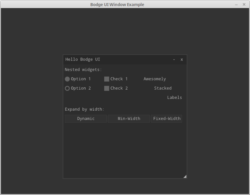
(defpanel (main-panel
           (:title "Hello Bodge UI")
           (:origin 200 50)
           (:width 400) (:height 400)
           (:options :movable :resizable
                     :minimizable :scrollable
                     :closable))
    (label :text "Nested widgets:")
  (horizontal-layout
   (radio-group
    (radio :label "Option 1")
    (radio :label "Option 2" :activated t))
   (vertical-layout
    (check-box :label "Check 1" :width 100)
    (check-box :label "Check 2"))
   (vertical-layout
    (label :text "Awesomely" :align :left)
    (label :text "Stacked" :align :centered)
    (label :text "Labels" :align :right)))
  (label :text "Expand by width:")
  (horizontal-layout
   (button :label "Dynamic")
   (button :label "Min-Width" :width 80)
   (button :label "Fixed-Width" :expandable nil :width 100))
  (label :text "Expand by width:")
  (horizontal-layout
   (button :label "1.0" :expand-ratio 1.0)
   (button :label "0.75" :expand-ratio 0.75)
   (button :label "0.5" :expand-ratio 0.5))
  (label :text "Rest:")
  (button :label "Top-level Button"))

(defparameter *window-width* 800)
(defparameter *window-height* 600)

(defclass main-window (bodge-ui-window:ui-window) ()
  (:default-initargs
   :title "Bodge UI Window Example"
   :width *window-width*
   :height *window-height*
   :panels '(main-panel)
   :floating t
   :opengl-version #+bodge-gl2 '(2 1)
                   #+bodge-gl2 '(3 3)))


(defun run ()
  (bodge-host:open-window (make-instance 'main-window)))
and run it:
(run)
To react to events, use the following signals:
:on-click
:on-hover
:on-leave
:on-change
:on-mouse-press
:on-mouse-release
They take as argument a function with one argument, the panel. But beware: they will be called on each rendering cycle when the widget is on the given state, so potentially a lot of times.
Interactive development
If you ran the example in the REPL, you couldn’t see what’s cool. Put the code in a lisp file and run it, so than you get the window. Now you can change the panel widgets and the layout, and your changes will be immediately applied while the application is running!
Conclusion
Have fun, and don’t hesitate to share your experience and your apps.
Page source: gui.md